NURIVA SKN
BRANDING
tools
Adobe Illustrator, Adobe InDesign
tEAM
Solo
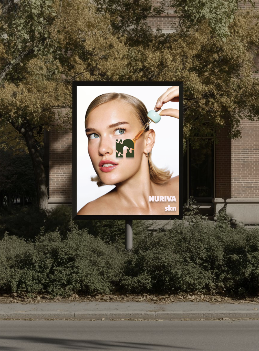
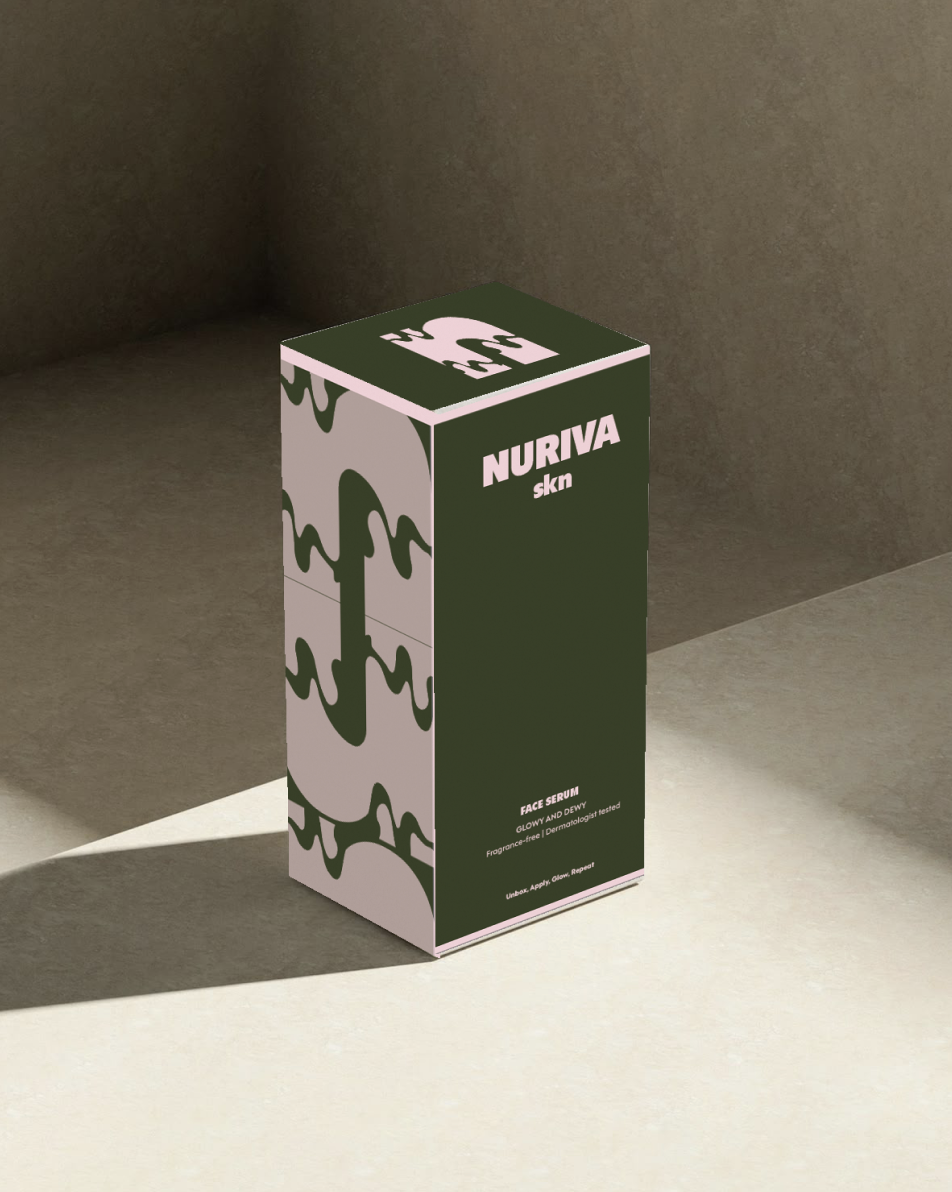
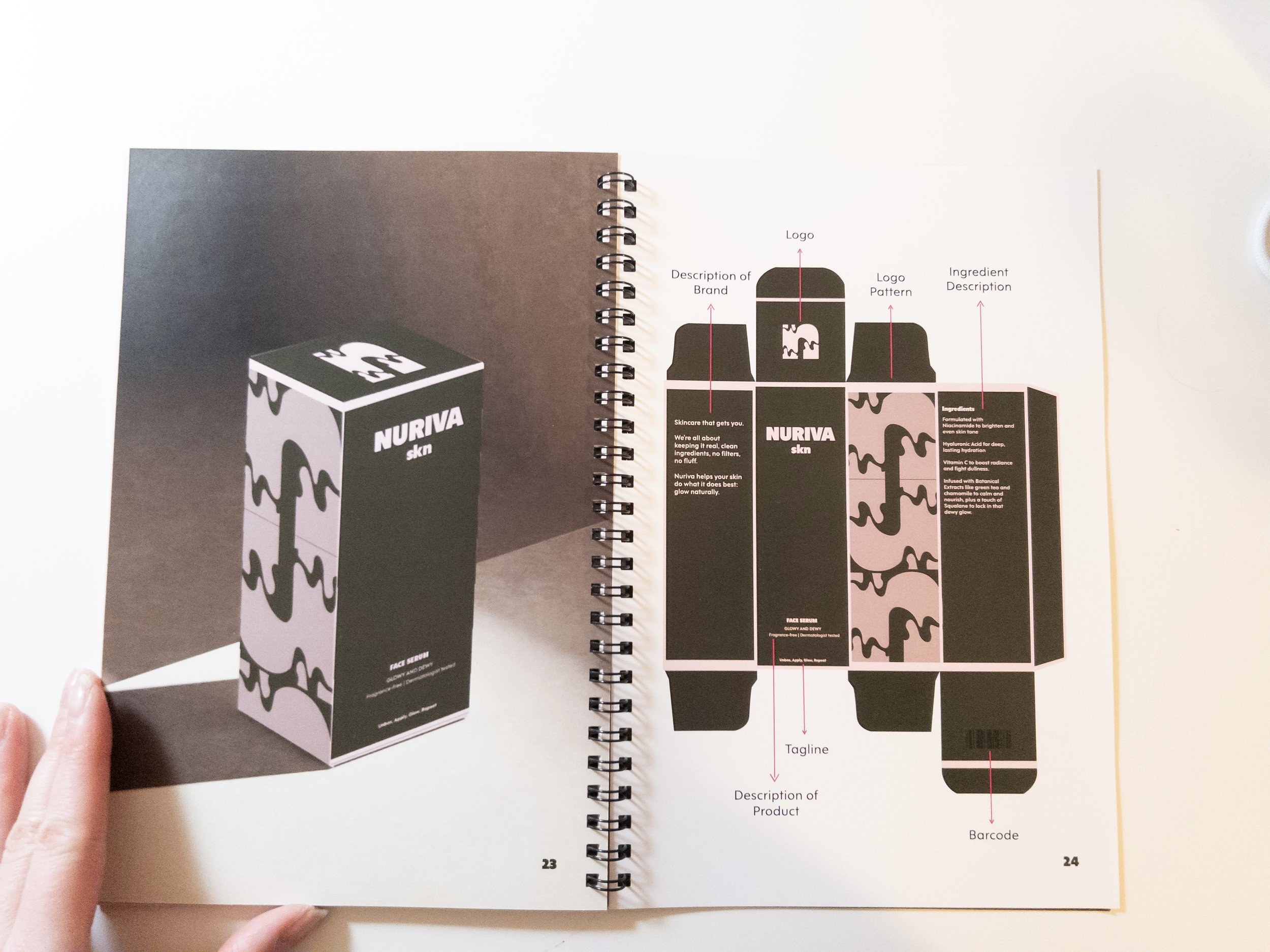
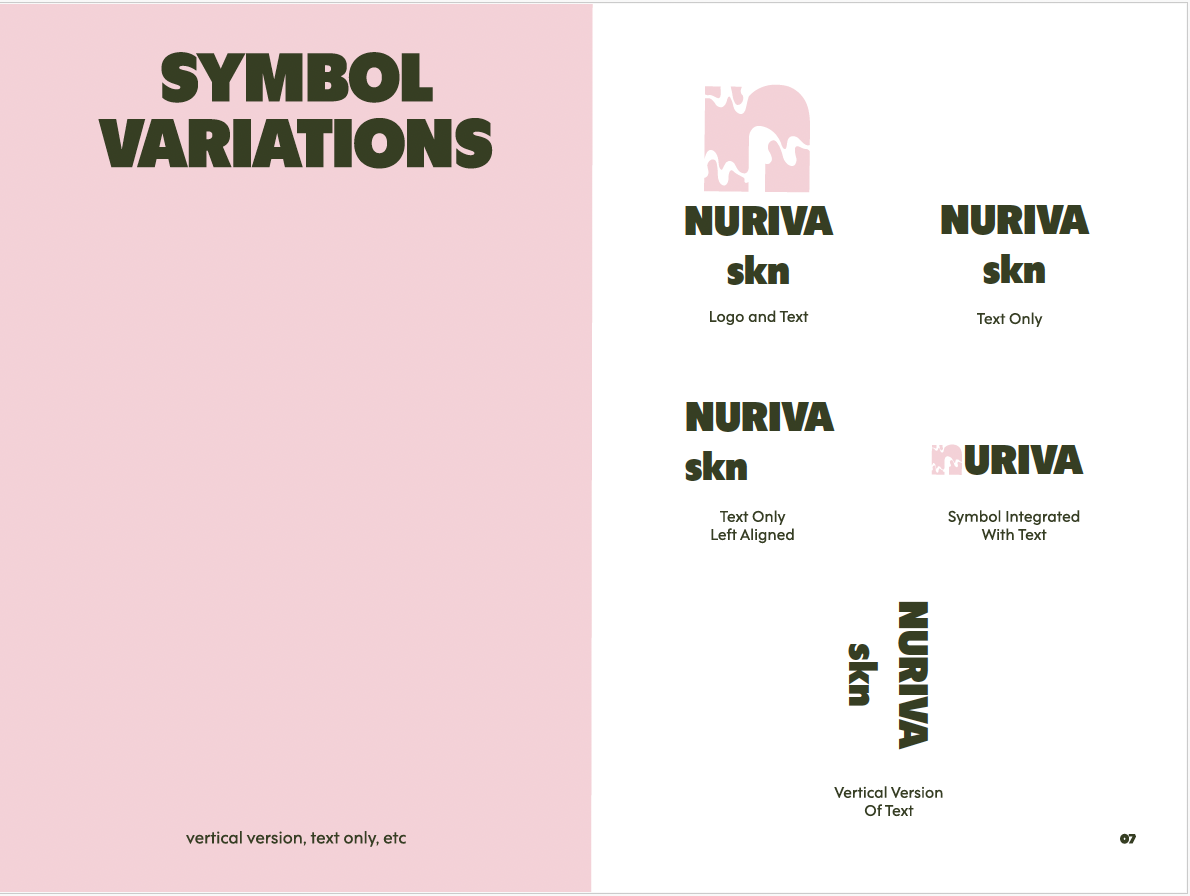
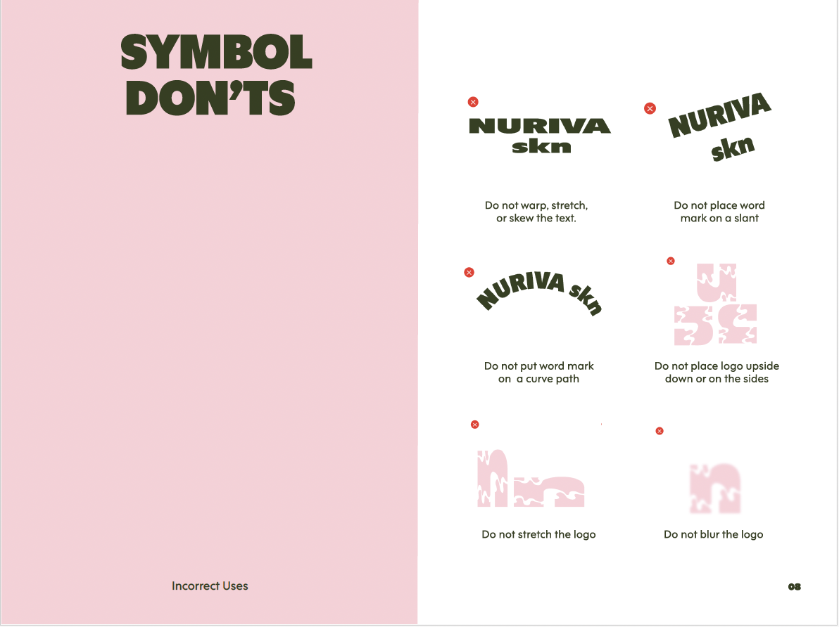

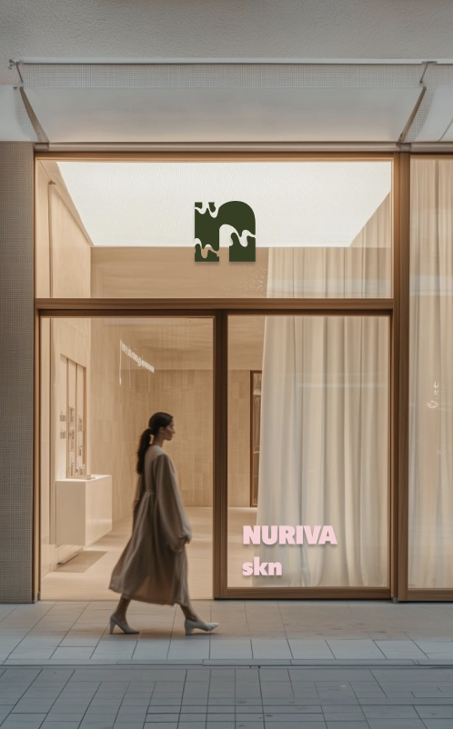
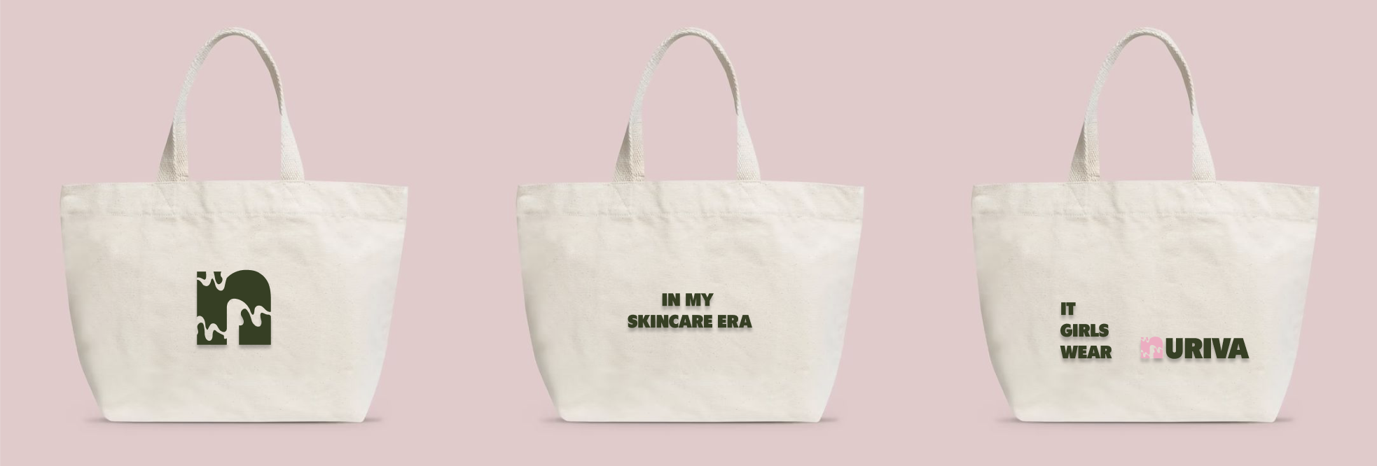
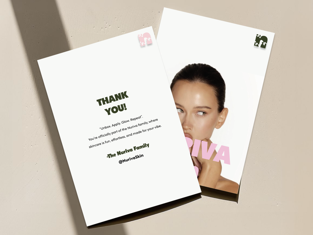
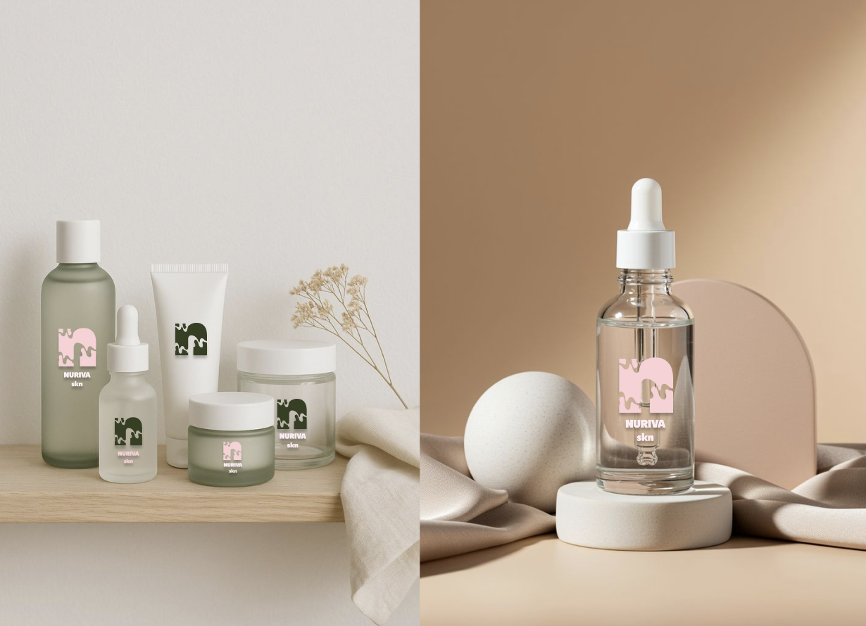
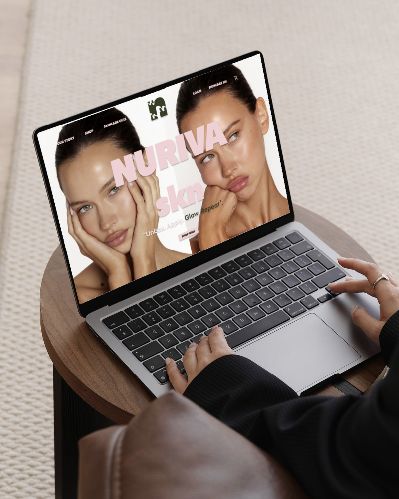
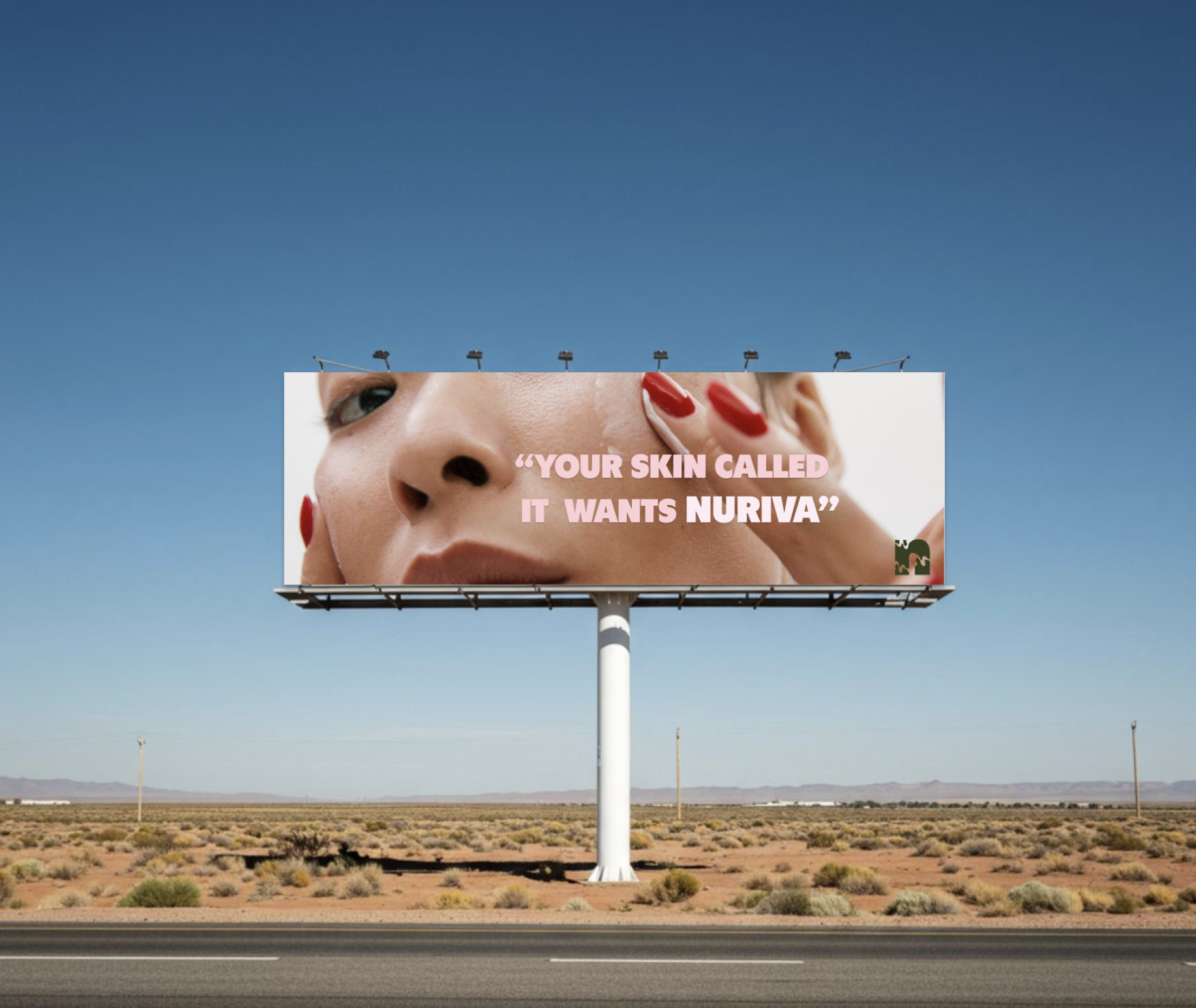
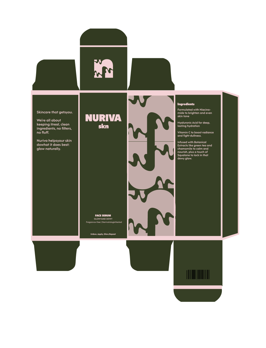
BRand applications
key Takeaways
Through this project, I learned how much thought goes into building a brand from scratch. Every choice, from the logo to the color palette, has meaning. Creating the brand book taught me to balance creativity with strategy, making sure the visual identity looked good and worked well across print and digital platforms. When I designed the logo, I focused on keeping it simple, scalable, and timeless, refining it until it captured the brand’s essence without extra details. I also learned a lot about typography, color psychology, spacing, and consistency. I realized that strong branding is more than just a nice logo—it’s about setting clear guidelines that protect and strengthen the brand everywhere it appears. In the end, I saw that branding is really about telling a story through design, with intention and structure that lasts.
Timeline
September-December 2025
(4 months)
Role
Lead Designer
Project Overview
This semester-long project involved creating a complete brand identity system for a brand. My concept was for a skincare brand targted towards Gen Z. The process began with research into Gen Z behavior, skincare culture, and branding trends, leading to explorations of symbols and wordmarks. One direction was refined into a cohesive visual identity emphasizing authenticity, inclusivity, and self-expression.
The identity was then applied across print and digital platforms—packaging, social media, and promotional materials. The project concluded with a brand manual outlining visual standards, usage guidelines, and best practices, providing a structured system for consistent implementation. The result is a fresh, expressive, and socially aware brand tailored for the Gen Z skincare market.
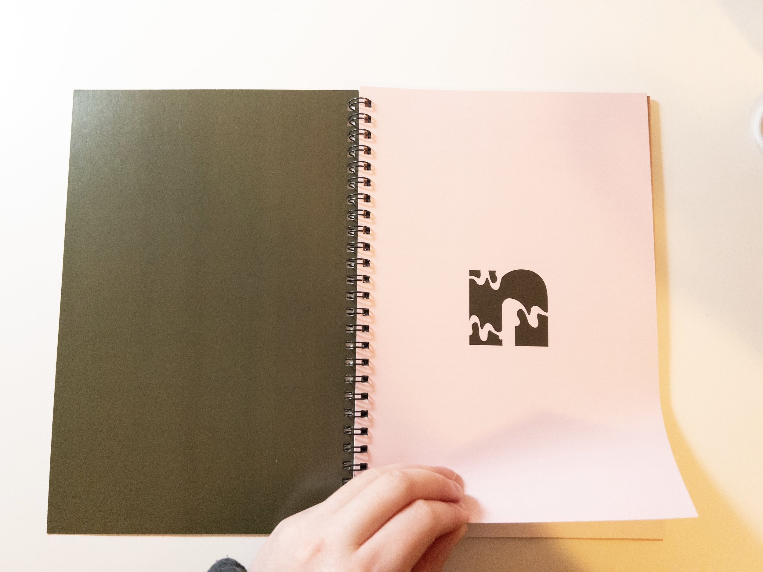
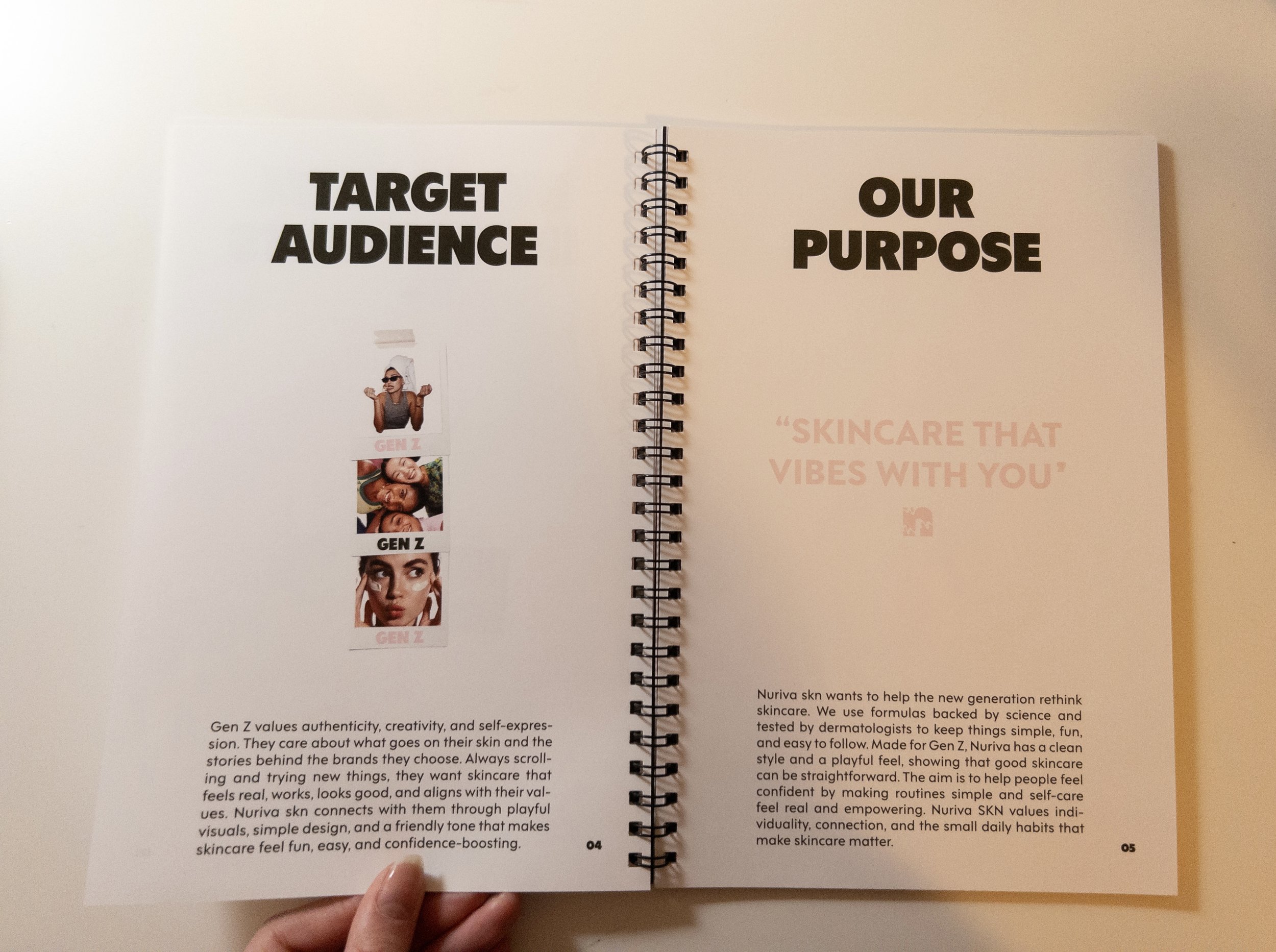
about nuriva skn
Nuriva skn wants to help the new generation rethink skincare. We use formulas backed by science and tested by dermatologists to keep things simple, fun, and easy to follow. Made for Gen Z, Nuriva has a clean style and a playful feel, showing that good skincare can be straightforward. The aim is to help people feel confident by making routines simple and self-care feel real and empowering. Nuriva SKN values indi-viduality, connection, and the small daily habits that make skincare matter.
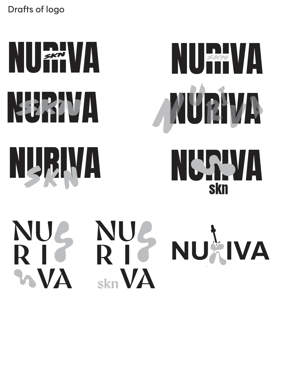
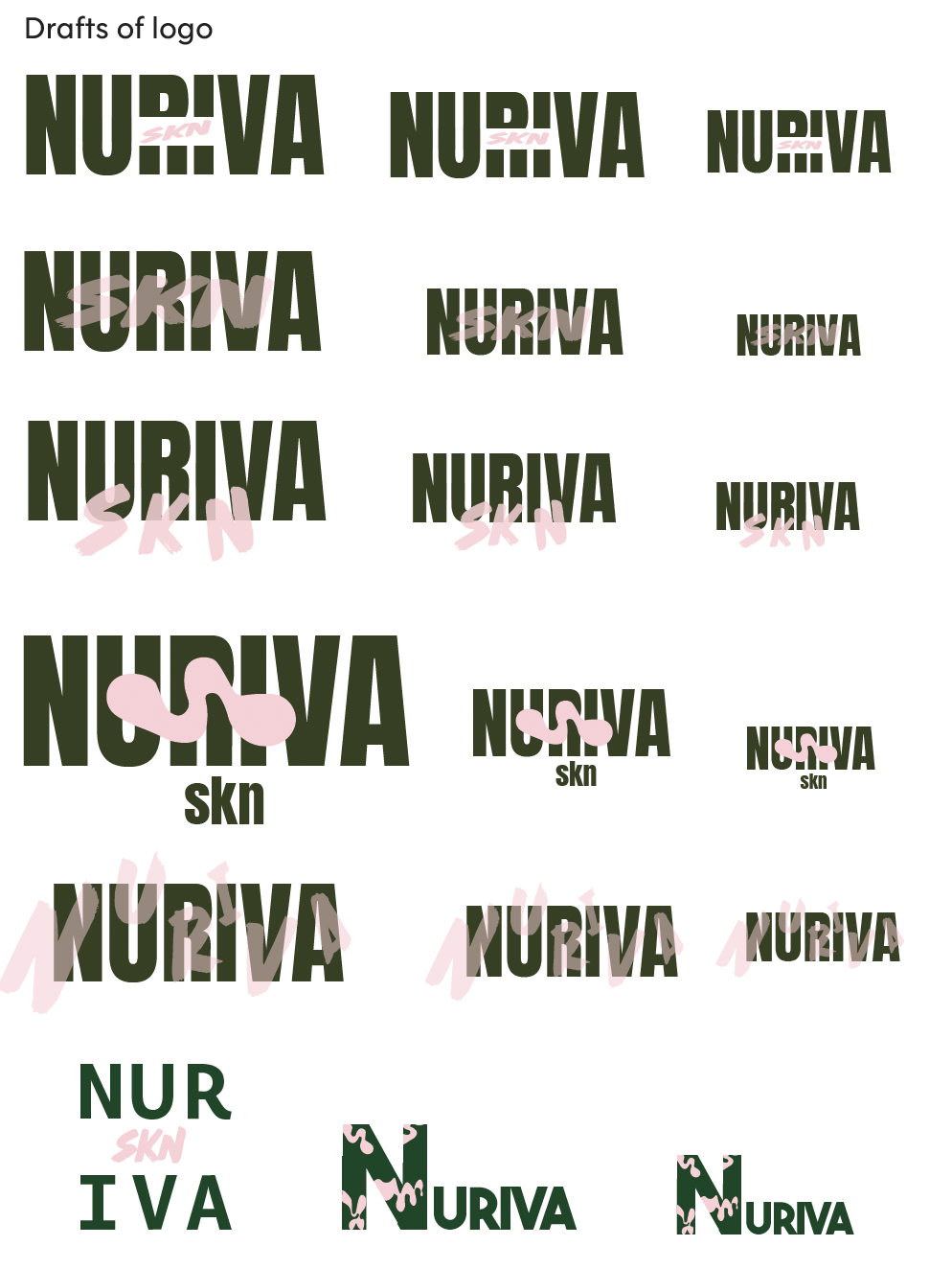
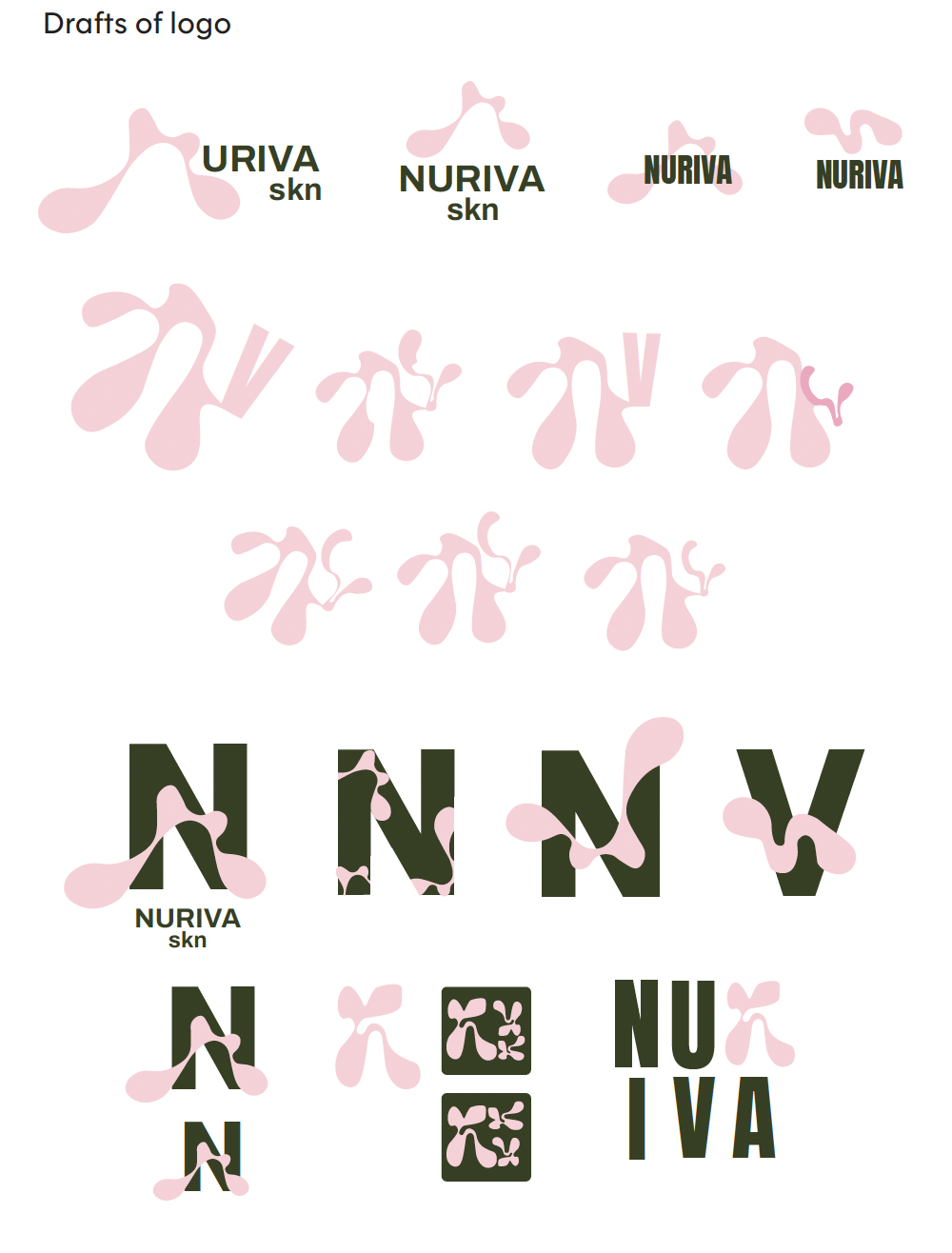
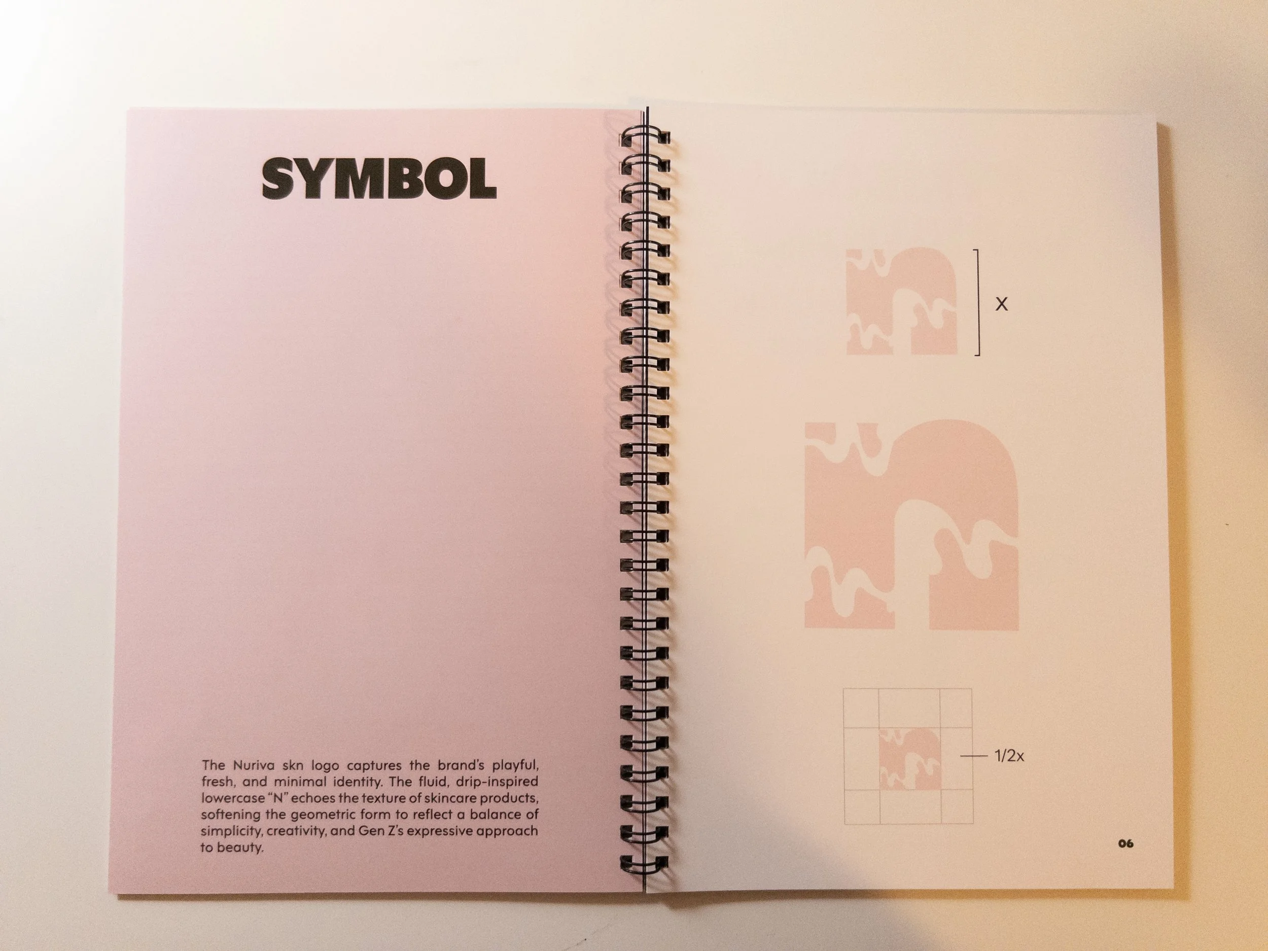
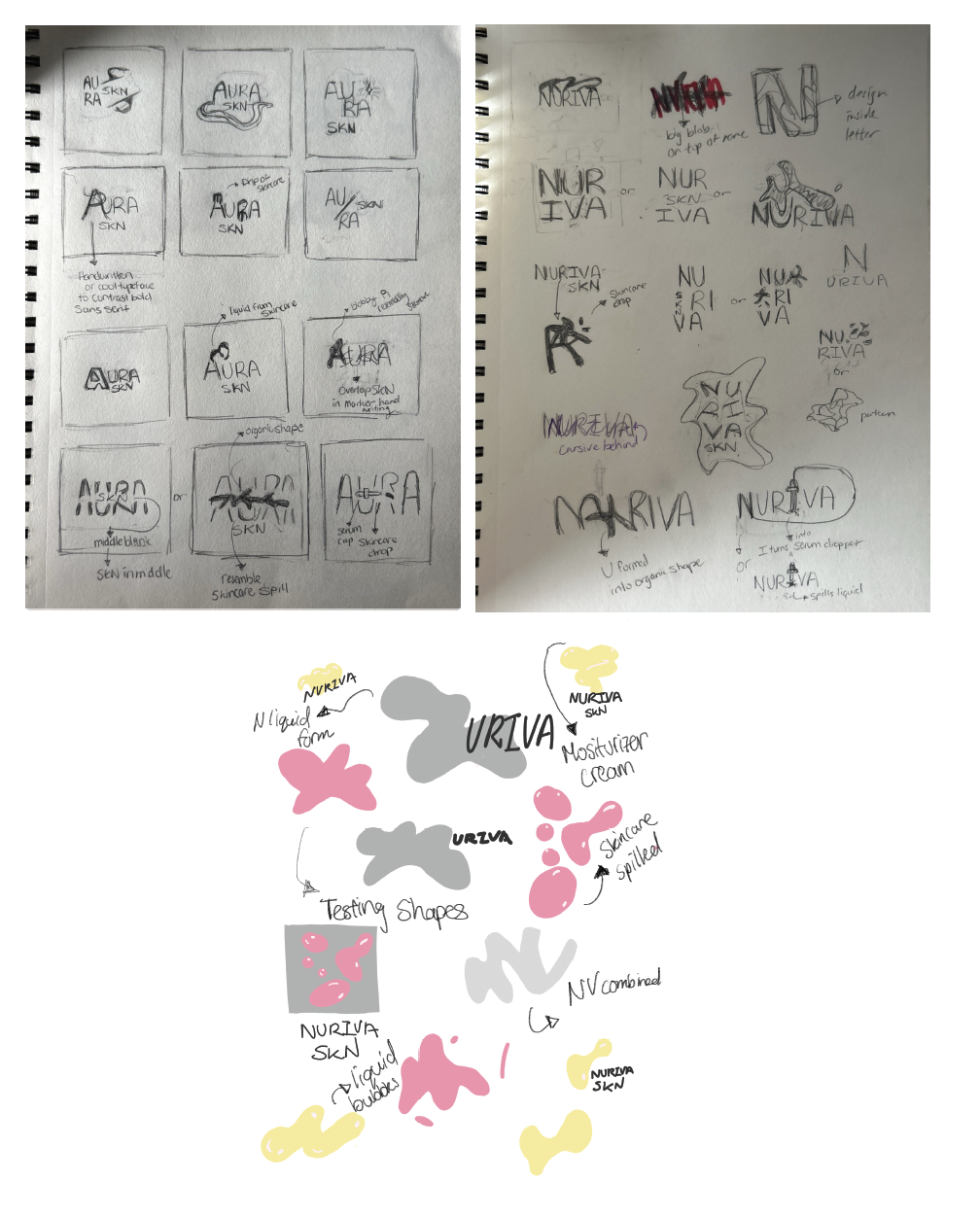
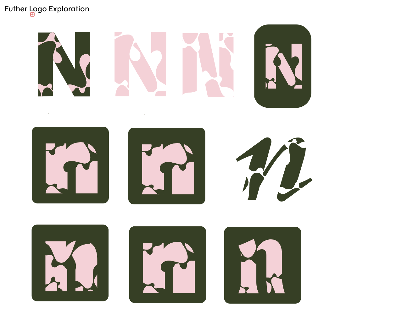
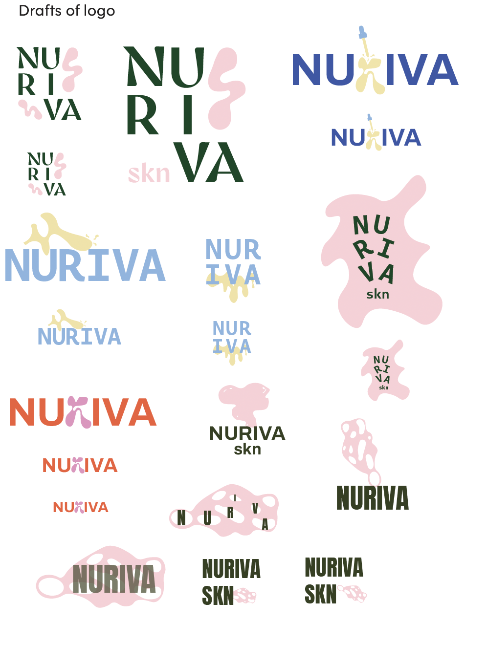
LOGO IDEATION
The goal of this project was to create a cohesive brand from scratch. My goal was to desig and create a brand hat resonates with a Gen Z audience and works seamlessly across both print and digital platforms. The process began with research into consumer behavior, skincare culture, and contemporary design trends, followed by explorations of symbols, typography, and color. These elements were refined into a unified visual identity, applied across packaging, social media, and promotional materials, and finally documented in a comprehensive brand manual to ensure consistent and flexible implementation.
INITIAL BRAINSTORMING
GOal Of Project
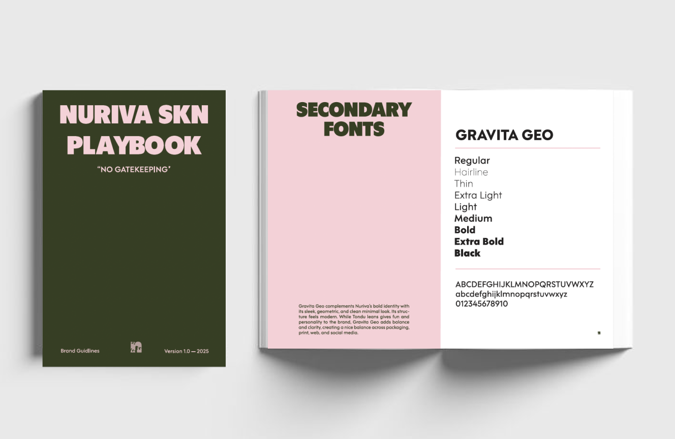
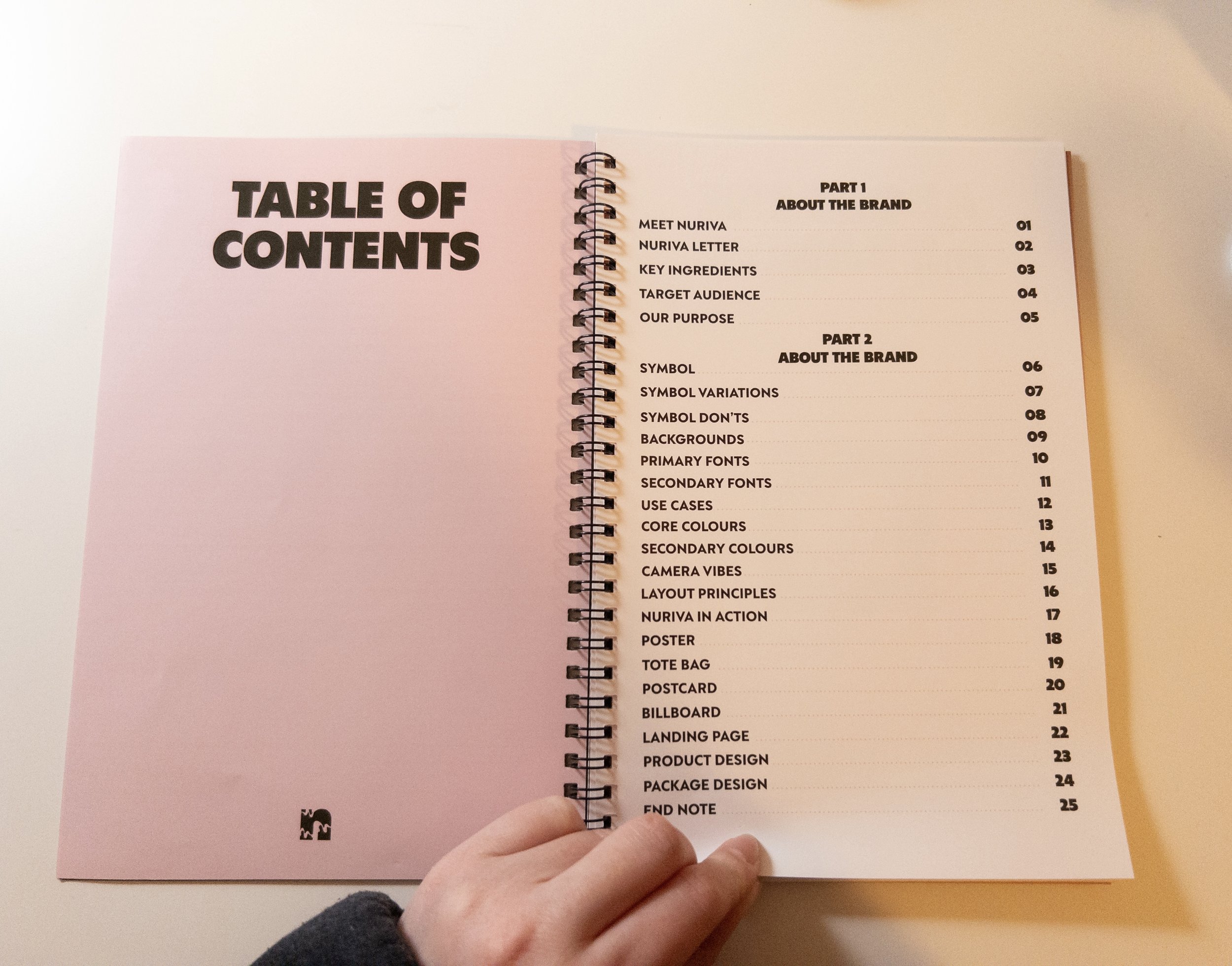
BRAND BOOK
BOOK Rationale
Nuriva SKN’s brand book was designed to feel less like a corporate manual and more like a personal skincare journal. That’s why it’s 6" x 9" and coil-bound — intimate, handheld, and reflective of the small daily habits that make skincare meaningful. The layout is clean and simple to mirror our science-backed, dermatologist-tested formulas, but the tone stays playful and relatable with subtle Gen Z language to keep it fresh and un-intimidating. The goal was to create something that feels trendy, approachable, and real, showing that good skincare doesn’t have to be complicated, just consistent.